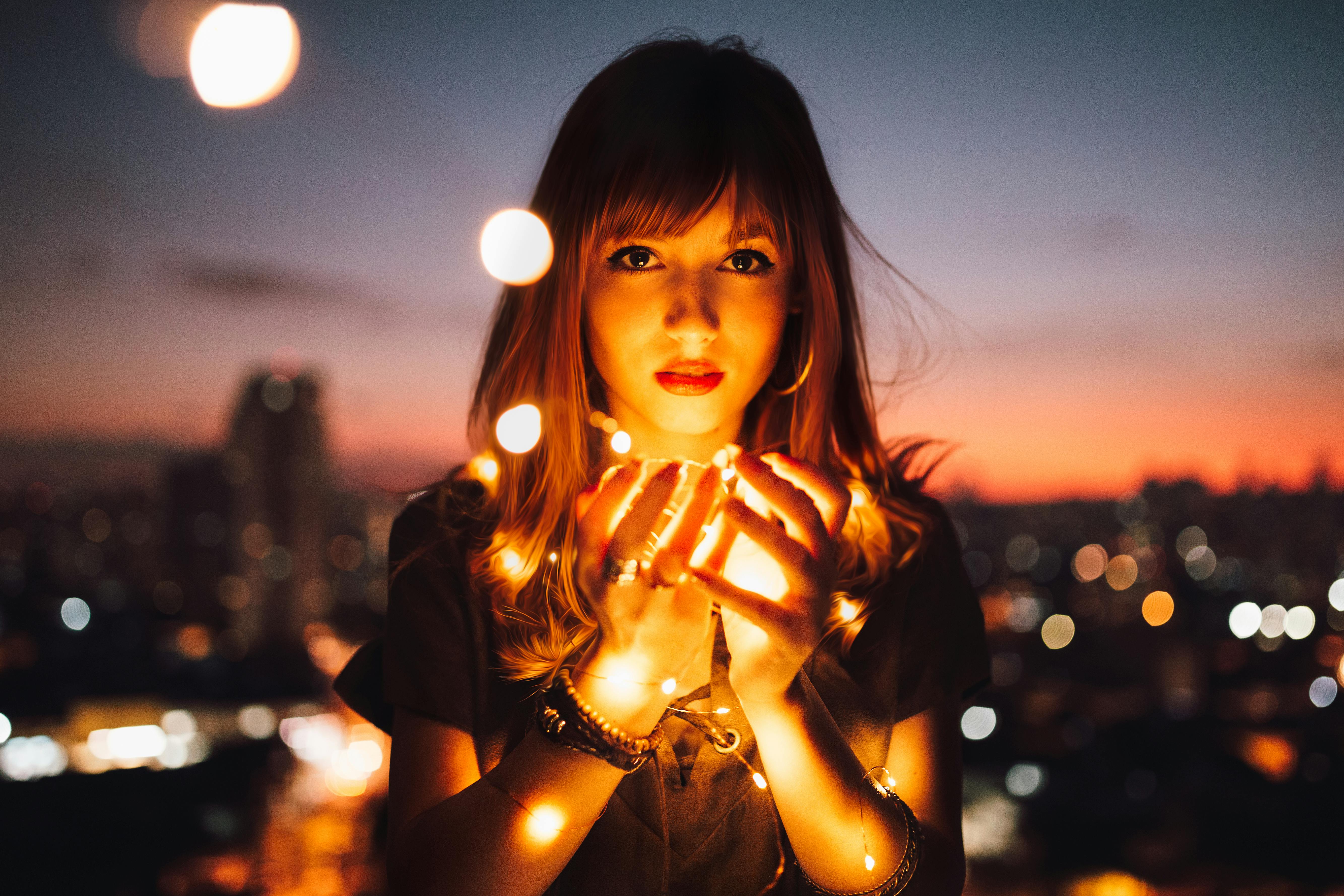
Some mornings feel washed in gray before your feet hit the floor. Other days arrive as a soft yellow—ordinary moments suddenly carrying a quiet lift. We don’t always have language for our inner weather, but we do have color. If you’re searching “mental health colors,” you might be looking for more than aesthetic advice. You’re asking how hue, light, and saturation can support emotional regulation, identity, and everyday well-being—without pretending paint can solve pain.
Color won’t do the therapy for us. But it can keep the room warm while we do the work.
A Gentle Frame for Mental Health Colors
When we talk about mental health colors, we’re really talking about the relationship between our visual environment and our nervous system. It’s less “blue equals calm, red equals stress” and more “how do my body, memory, and culture respond to what I see?”
Psychology offers a few helpful anchors:
- Arousal and regulation: Highly saturated, warm tones tend to elevate energy; desaturated, cool tones often downshift arousal.
- Association and identity: Personal history, attachment, and culture shape meaning. Teal can be safety for one person and grief for another.
- Cognitive load: High contrast sharpens focus; soft palettes reduce decision fatigue and soothe overstimulated systems.
Think of color as behavior design. It’s one cue—alongside routine, light, texture, and boundaries—that teaches your body how to land.
Mental Health Colors in Daily Life
You already use color to self-regulate. You reach for a particular sweater before a hard meeting. You choose a mug that steadies your hands. You dim the lamp that signals “work is over now.”
Color doesn’t just hit the retina; it taps memory. A moss-green throw might recall a safe childhood corner. Electric orange might carry a friend’s laugh. This is why blanket prescriptions fail—color is relational.
If you want to notice your personal palette, try a gentle check-in:
- Which colors do I reach for when I’m anxious?
- Which hues show up on my best, most honest days?
- Where in my home does color invite me to rest—and where does it push me away?
Treat your answers as data, not doctrine.
The Psychology of Hue, Saturation, and Light
There are three levers you can actually adjust.
- Hue: the family of color (blue, green, red). Warm hues (reds/oranges) can feel energizing; cool hues (blues/greens) often feel calming. Your history can override the rule.
- Saturation: intensity vs. softness. High saturation wakes up the nervous system; low saturation tends to soothe. If anxiety is loud, saturation matters more than hue.
- Luminance (lightness): brighter shades feel airy; darker shades feel contained. In depression, very dark palettes may deepen inertia; in overstimulation, gentle mid-tones help the body exhale.
You’re not choosing a single mental health color. You’re shaping an emotional climate.
Room-by-Room: Using Mental Health Colors with Intention
You don’t need a renovation. Target the spaces where your nervous system does key jobs: waking, working, relating, resting.
For Focus and Flow
Choose cooler hues (soft blue, sage, slate) with medium lightness and low-to-moderate saturation.
Why: reduces arousal without making you sleepy; lowers cognitive noise so attention sticks.
Practical tip: add one saturated “start” cue (cobalt mug, coral notepad) to initiate focus without overwhelming the field.
For Rest and Recovery
Warm neutrals (linen, sand, clay) or dusty greens/blues, low saturation, and warm white lighting (2700–3000K).
Why: warmer light supports melatonin; softer palettes cue the nervous system to release.
Practical tip: use dimmable lamps over overheads. Lighting temperature often matters more than wall color.
For Connection and Play
Neutral base with one or two joyful accents (mustard, teal, terracotta).
Why: enough energy to invite conversation; enough softness to avoid sensory spike.
Practical tip: put color in objects (pillows, art, flowers) rather than walls if your mood shifts seasonally.
For Grounding and Grief Care
Deep, desaturated tones (forest, aubergine, charcoal) plus texture (wood, wool).
Why: containment and weight can feel safe; texture invites the body to land.
Practical tip: pair a light element (cream throw, warm lamp) to prevent heaviness from tipping into collapse.
Trauma, Attachment, and Color Memory
If you have a trauma history, proceed gently. Visual triggers can bypass logic. Attachment patterns shape preference too: anxious systems may crave brighter palettes for reassurance, while avoidant systems may prefer cool minimalism to maintain control.
Try slow experiments:
- Introduce a small item (mug, scarf, pillow) in a new color and track your body’s response—jaw, shoulders, breath, sleep—over a week.
- If a color spikes anxiety, reduce saturation or move it to a smaller surface. Agency beats aesthetics.
In therapeutic language, you’re building “felt safety.” Color becomes one of many cues—like tone of voice and routine—that tells your nervous system it can rest.
Mental Health Colors at Work and on Screens
Screens are rooms. High-luminance, high-contrast interfaces wear down attention. Consider:
- Dark mode at night to lower luminance and reduce eye strain.
- Reader modes with sepia or low-contrast backgrounds for long texts.
- Color-coded task tags by energy: green for quick wins, amber for deep work, blue for communication. This pairs color with CBT-adjacent behavior design.
In offices, negotiate light before paint. Harsh cool lighting (5000K+) can feel like perpetual noon. Warmer lamps and task lighting create zones of control and kinder arousal levels.
Practices to Make Color Work for You
A Two-Week “Color Ritual” Experiment
- Morning ritual: choose one steadying color you wear or hold; name the quality it represents (ease, courage, clarity).
- Evening ramp: shift lighting to warm and dim 60 minutes before bed; note sleep and mood.
- Workspace audit: neutral base plus a single saturated “start” cue; track focus and reactivity.
Keep notes, not judgments. Your body is the lab.
A Gentle Checklist
- Do the colors and lights match the job this room needs to do?
- Which hue calms my breath within 30 seconds? Place it in reach.
- Which shade feels like pressure? Reduce saturation or relocate it.
- Where can I add softness (texture, warmth) instead of more hue?
Boundaries You Can See
- A “shutdown” lamp: switch to amber to end work; let the color do the boundary-setting.
- A “no meetings” scarf or mug on camera days—your quiet signal to yourself.
- A rest-only blanket in a comforting shade; when it’s on, your phone docks away.
Common Myths to Release
- “Blue is always calming.” Your history decides. If blue recalls a difficult school uniform, it may activate you.
- “Bright color equals positivity.” High saturation can overstimulate anxious systems. Joy can be dusty rose or moss as much as neon coral.
- “Color is superficial.” Environment is part of therapy. Small cues compound into real habit change.
Culture, Identity, and Permission
Colors carry culture. White can mean mourning or purity depending on where you stand. Gold can mean celebration or excess. If you live between cultures, your palette might too. Let that be allowed.
Identity evolves. So will your colors. When a shade stops serving you, let it go without diagnosing yourself. You’re not failing a brand; you’re listening to a living body.
Mental Health Colors, Reframed
You don’t need a perfect palette. You need a few colors that love you back—hues that let your breath even out, lights that tell your shoulders they can drop, tones that remind you to close the laptop. Colors that say, “You’re safe enough to feel this,” and “You’re allowed to want more.”
On gray days, reach for one soft hue and one kind light. On yellow days, let it last a little longer. Healing is rarely dramatic. It’s a room you return to—again and again—until staying becomes easier than leaving.
---
Leave a comment
This site is protected by hCaptcha and the hCaptcha Privacy Policy and Terms of Service apply.